Published inUX CollectiveWill UX metrics ever become high-level business metrics?Takeaways from the Persuasive UX Metrics FrameworkApr 23, 20213Apr 23, 20213
Published inIngeniously SimpleOne functional brand identity — inspired by road signsA brand identity has a very important job to do, a fundamental function: To identify its brand’s name.Jan 6, 2020Jan 6, 2020
Published inIngeniously SimpleContrasting UI components: Passing the new standardsA guide to the new accessibility criteria for UI components.Oct 8, 20191Oct 8, 20191
Published inUX CollectiveBuzzOps: 4 ways to cope with buzzwordizationEmbracing the waffle.Sep 6, 2019Sep 6, 2019
Published inUX CollectiveIf I have 6 hours to chop down a tree……would I spend 4 hours sharpening the axe?Aug 12, 20191Aug 12, 20191
Published inUX CollectiveThe light and the dark side: creating a UI colour system in 3 stepsChoosing a colour palette is easy … but add accessibility standards, various button states, and a couple of themes to the mix, and it soon…Apr 24, 20183Apr 24, 20183
Published inIngeniously SimpleUnexpected benefits of colour and contrast standardsAlthough just a small step towards inclusivity, colour and contrast standards could be a very important first step in getting accessibility…Nov 20, 2017Nov 20, 2017
Time to talk accessibilityTicking all the boxes may not lead to good accessibilityJun 26, 2017Jun 26, 2017
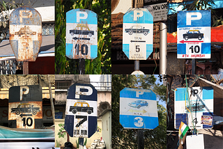
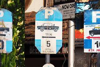
Could a UI design system have character? — A system of inconsistenciesOn my last visit to Mumbai I became a little obsessed with the road signs. The blue and white taxi signs (above) are among my favourites…Jun 24, 2017Jun 24, 2017